What Is “Natural Living” Design?
Often, clients assume that a natural palette is limited to wood finishes. However, we think true depth is achieved through a combination of foundational colors, complementary textures, and authentic materials. This allows us to design spaces that feel warm and grounded while still feeling modern and clean.
To us, colors are a perfect way to express your personality. This is why we feel it is important to get to know you and listen to your needs and vision first. At German Kitchen Design, we offer over 70 different front colors, including our new 2026 line of natural and warm tones like “Coffee” and “Macchiato.”
These foundational earth tones – Sand, Coffee, and Macchiato – serve as strong starting points. From this base, we can build a wide range of distinct styles, from the ultra-modern to the comfortably classic. Here are seven ways we apply these tones to create modern kitchen designs in the natural living look.
Our 8 Nature Living Looks
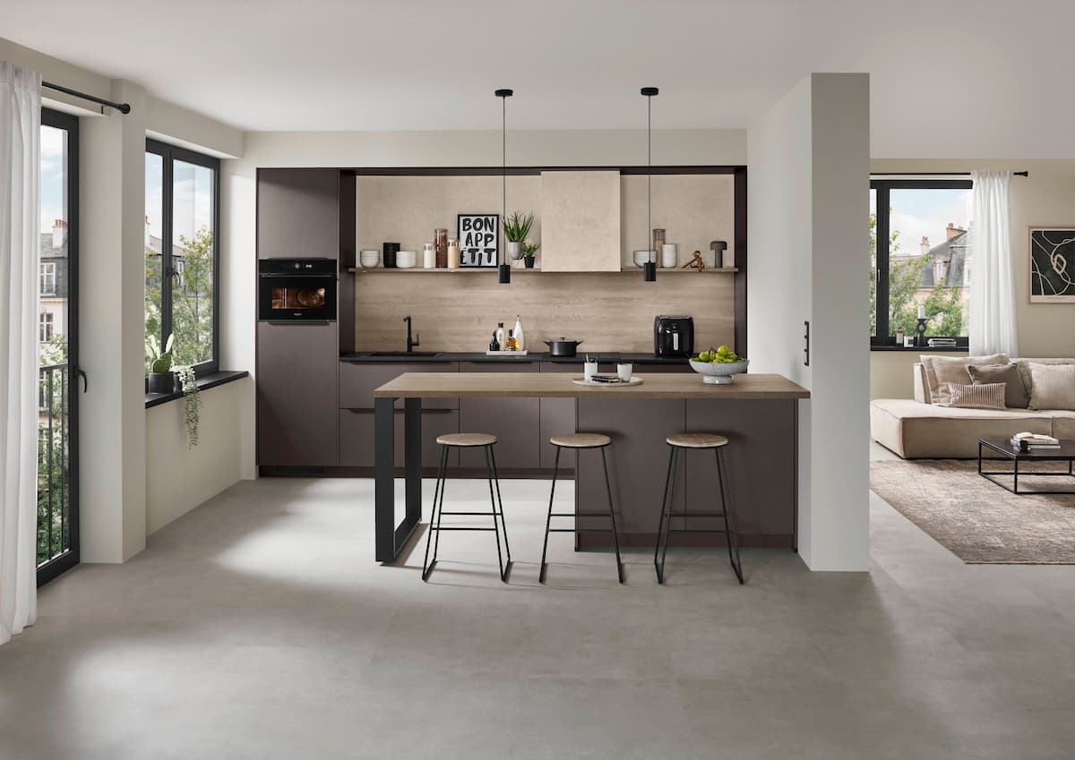
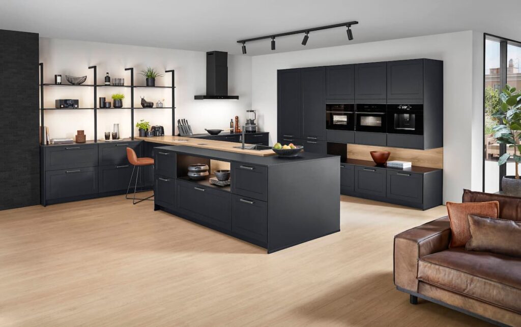
Look 1: The Sophisticated Urban Loft
This is a bold, contemporary aesthetic that pairs deep, rich tones with industrial textures – an ideal choice for a modern city dwelling where you want the kitchen to act as a statement piece. See how the fronts add further highlight the lighter accents.
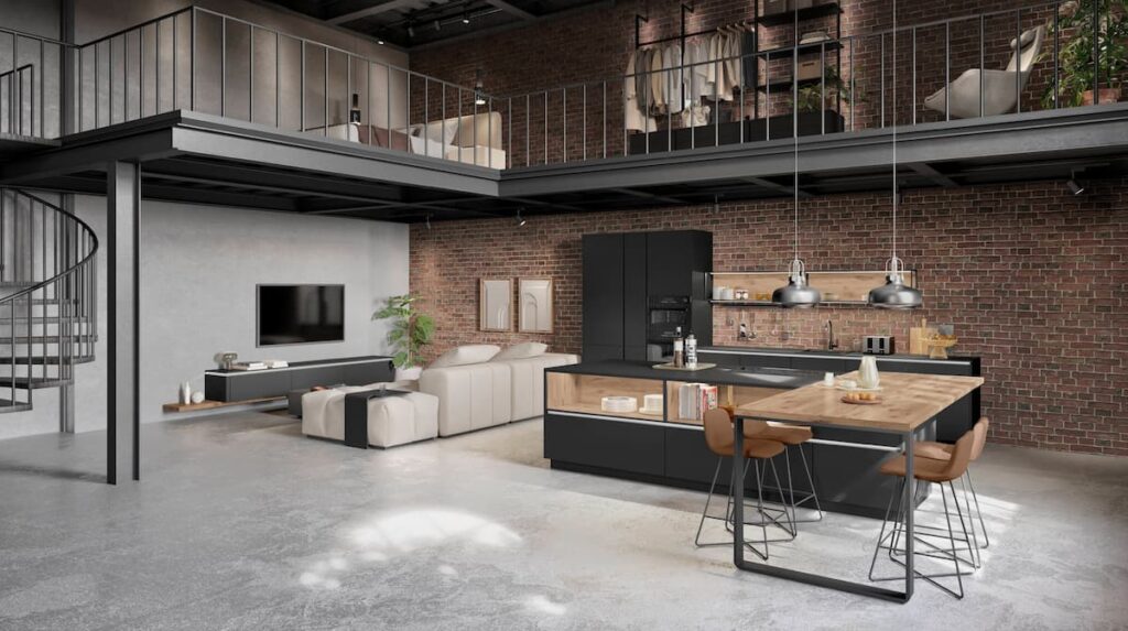
- Front: SENSO in Matte Black or the new LOOK in Coffee.
- Worktop: A light wood reproduction or a concrete-effect surface.
- Accent: Open shelving with metallic accents and details to complement the surroundings.
Look 2: The Modern Coastal
For an airy atmosphere that feels fresh and bright, we utilize soft tones and maximize natural light. This palette is about subtlety and openness.
- Front: SYLT in Perfect Honed Sand.
- Worktop: A light stone or wood reproduction.
- Accent: A subtle, textured wood niche cladding with detail to help add visual variation.
We saw the impact of this approach in our Sukhumvit 24 project. In that residence, using a light, white, and glossy front helped to visually enlarge a relatively small kitchen area, transforming it into a generous heart of the home.
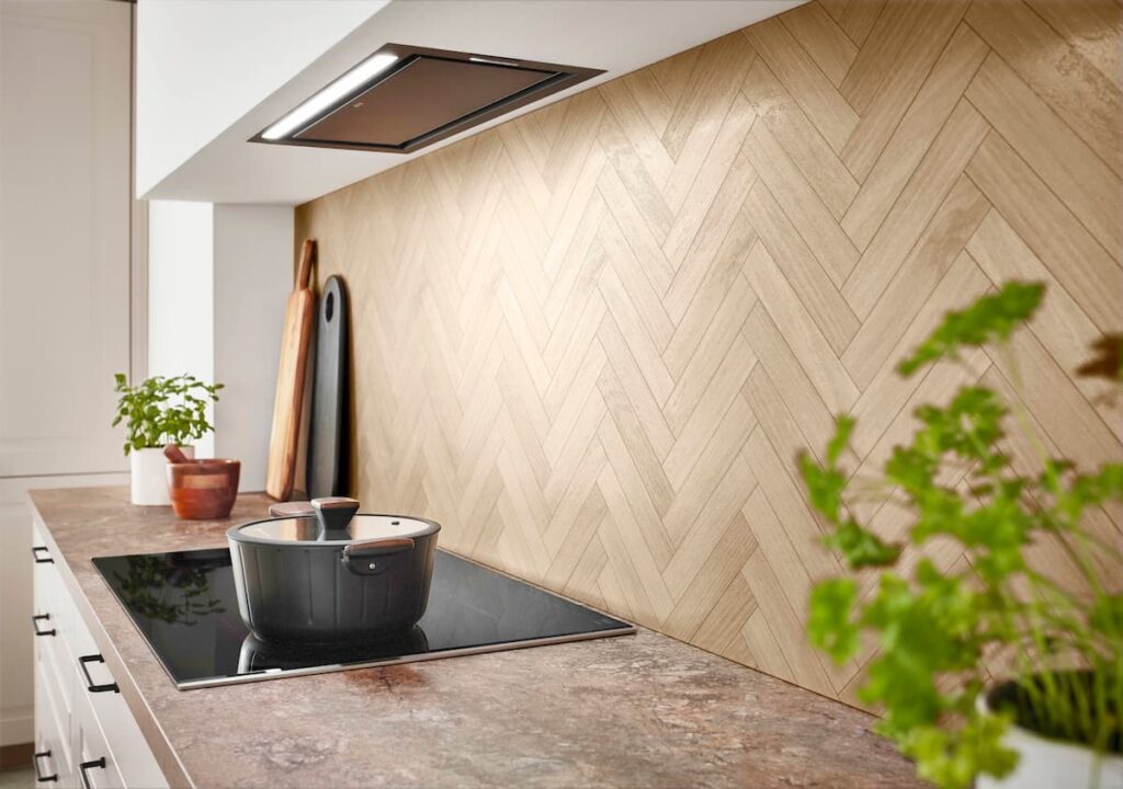
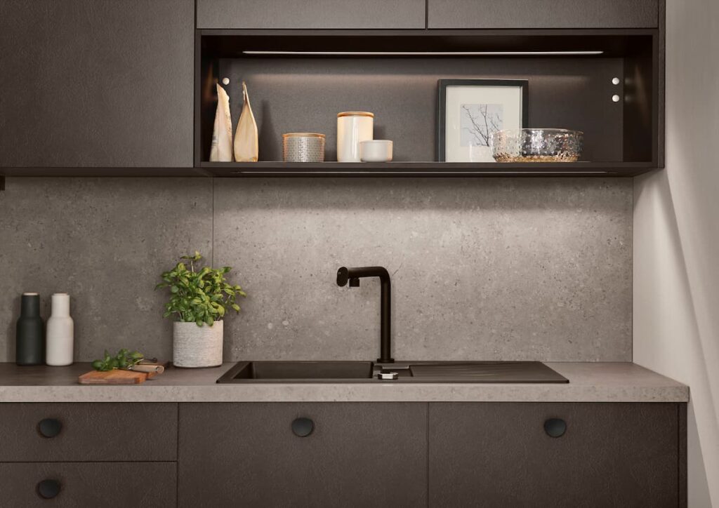
Look 3: The Warm Industrial
This style balances raw, industrial elements with warm, inviting tones. It is less stark than a pure industrial look, offering more character and liveability.
- Front: A mix of Coffee Textured LOOK and a smooth matte front.
- Worktop: A durable, slate-grey or concrete-look worktop.
- Accent: A gritty, textured niche cladding and black metal hardware.
To balance warm and industrial elements without the space feeling too cold or too rustic, we always look at the surroundings of the kitchen first. We analyze the floor, ceiling, windows, and the view.
Based on these existing elements, we play with color combinations until we find the perfect balance for the specific space.
Look 4: The Refined New Cottage
This is a fresh take on classic comfort. We combine traditional framed fronts with contemporary colors for a modern Cottage Style.
- Front: FRAME in Macchiato or Olive Wood Texture.
- Worktop: A warm, veined marble reproduction.
- Accent: Classic hardware in a dark, contrasting finish.
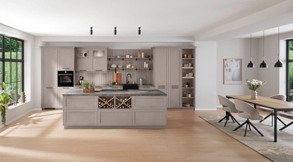
While Shaker kitchens are known for their simple, unpretentious design, our Cottage schemes take this further to create a cozy atmosphere. We often mix simple Shaker-profile doors with glazed fronts, dressers, and plate racks to add depth and interest.
Look 5: The High-Contrast Natural
A dynamic and confident look that pairs the darkest and lightest natural tones for a striking visual impact.
- Front: NORDIC in Perfect Honed Black.
- Worktop: A light wood reproduction or heavily veined white marble reproduction.
- Accent: Light Oak or glass shelving and niche cladding to soften the contrast, with light handles for contrast.
Look 6: The Soft Minimalist
Softer and more inviting than stark white minimalism, this palette uses gentle, warm tones for a calming and uncluttered space.
- Front: SOFTLINE in Perfect Honed Sand.
- Worktop: A contrasting textured wood worktop for a monolithic look.
- Accent: Handleless design (LINE One) to maintain clean lines.
We are often asked if tone-on-tone palettes, like sand fronts with a sand worktop, are effective. Yes, it can work beautifully.
Again, it is a matter of looking at the overall setup of the home. Tone-on-tone kitchens work well if accents are set in other areas. Each space is different, and it is important to have a personalized analysis for each place to ensure the room doesn’t feel flat.
Look 7: The Luxe Natural
An opulent palette that combines rich natural tones with luxurious, high-gloss finishes and metallic accents.
- Front: NOVALUX in Taupe Grey High Gloss.
- Worktop: A dark, high-contrast marble or quartz.
- Accent: Neutral metallic handles that add understated opulence, and glass elements with integrated lighting for a dedicated “feature” zone.
Integrating high-gloss fronts into a “natural living” palette requires careful consideration of the overall space to ensure they do not feel out of place. When done correctly, the reflection adds a layer of sophistication to the earthy tones.
Your Style, Your Story
A “Natural Living” palette is incredibly versatile. Whether you prefer a minimalist, industrial, or classic aesthetic, these earth tones provide a sophisticated foundation that can be tailored to your style.
The possibilities are endless. We invite you to contact us or visit our River City Bangkok showroom to mix and match materials and begin crafting the perfect palette for your home.